Before and After: 7 Kitchen Remodels with Lowcountry Flair
August 17, 2020
Who doesn’t love a good before and after story? Today, we’re sharing 7 of our favorite kitchen transformations with Lowcountry flair in Bluffton, Hilton Head, Palmetto Bluff and beyond. From a British West Indies inspired design, to a white and bright oasis, to a modern kitchen with colorful cabinetry, let these gorgeous renovations inspire your next home project. Let’s get started!
1. White and Bright
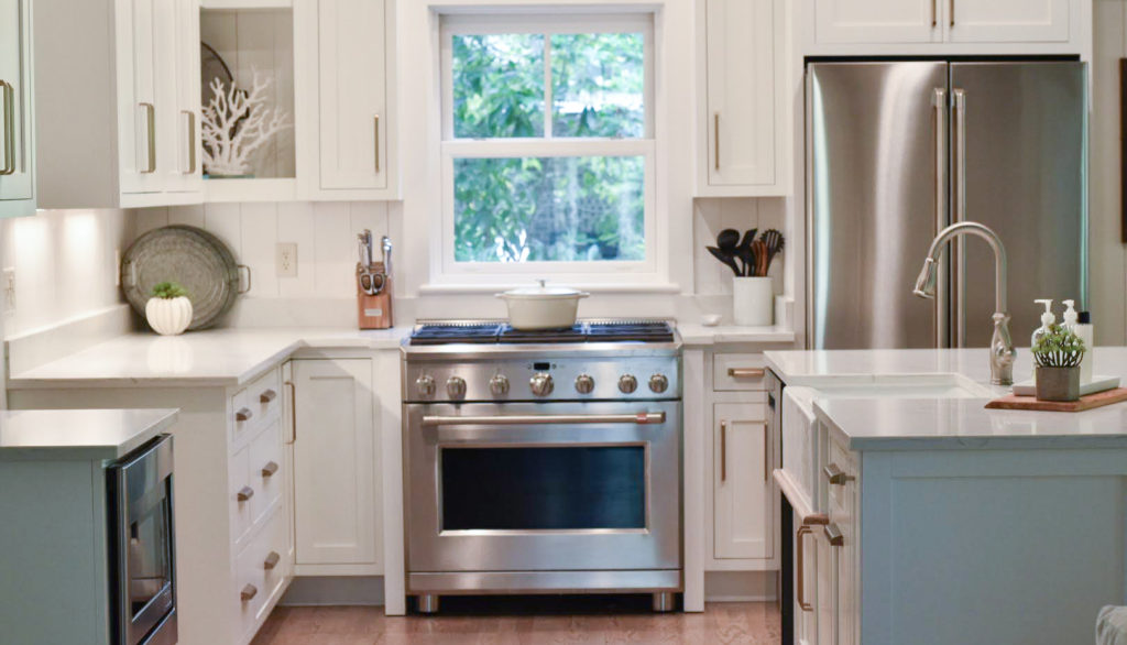
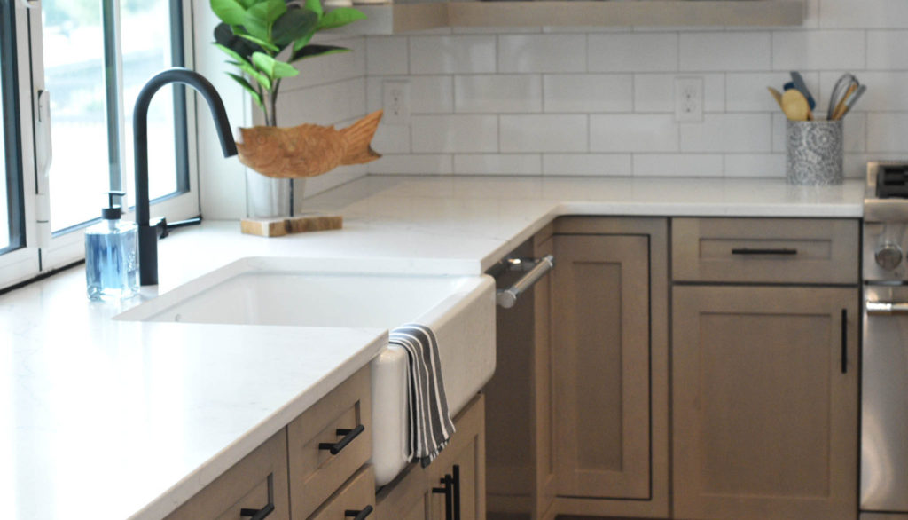
Our goal for this project was to transform this vacation home into an easy-going space that allowed for free movement and connectivity. We knew that the current layout, being a bit closed off, would make this difficult for the family. One of the key decisions we made in the design process was to completely gut and transform the kitchen. We started by tearing out a section of wall, removing the cabinetry, and finding a new home for the existing appliances. Giving this kitchen a new coat of paint, brand new Shaker cabinets with modern pulls, quartz countertops, a 6-burner gas range, and an updated layout did wonders to create a seamless gathering space for this family!
2. Lowcountry Natural
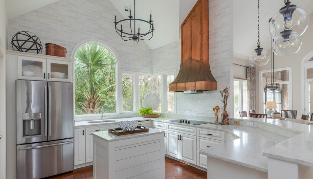
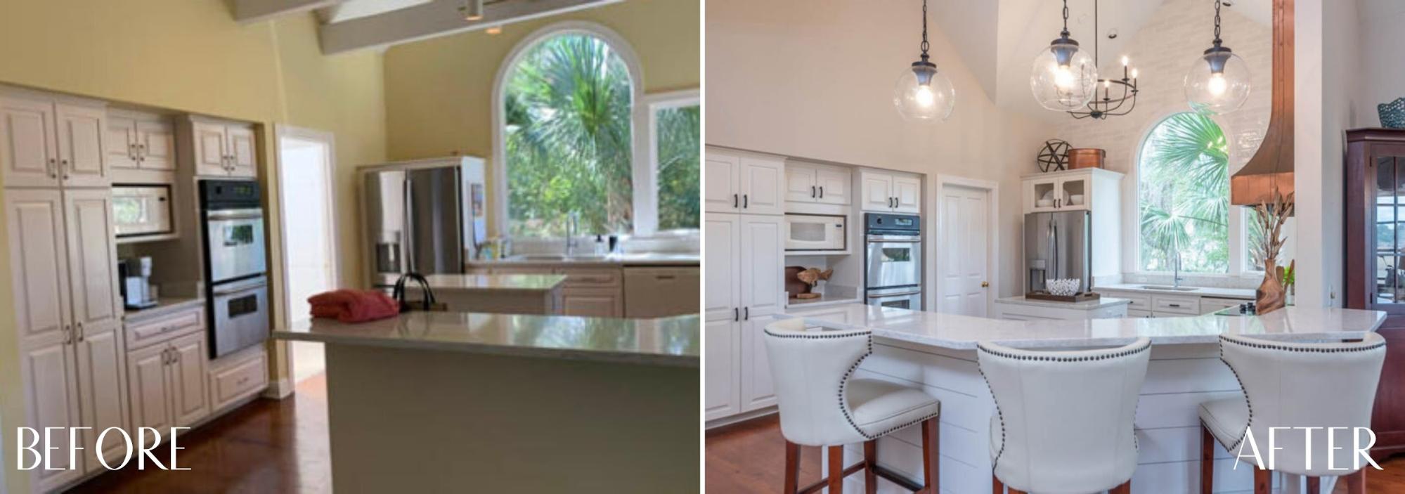
With this kitchen’s existing vaulted ceilings, we were very excited to work within this space. Talk about a solid design foundation! The clients’ main goal for this project was to create a relaxed living environment that integrated with the natural landscape surrounding the home. To open up the space, we removed the beams that were covering up the vaulted ceilings and causing the kitchen to feel smaller. Adding white and grey tiling to two of the main walls gave the space some texture and allowed the copper vent hood to take center stage. For cohesiveness, we added bronze lighting fixtures and decor in a similar bright white and earthy palette. One change that made all the difference: building new cabinets above the refrigerator to create symmetry with the existing windows against the back wall.
3. Lowcountry Casual
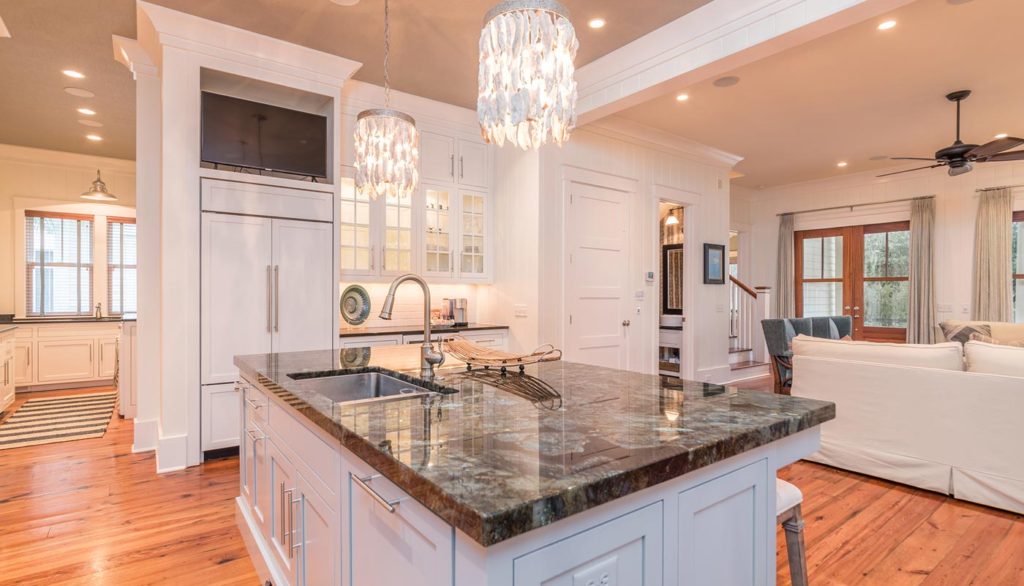
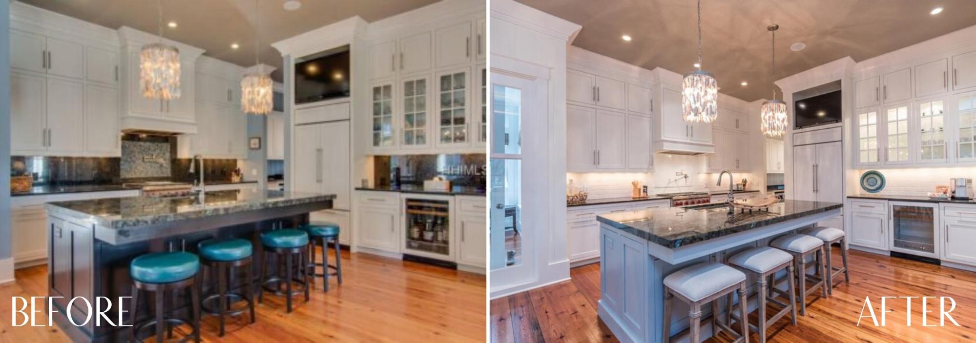
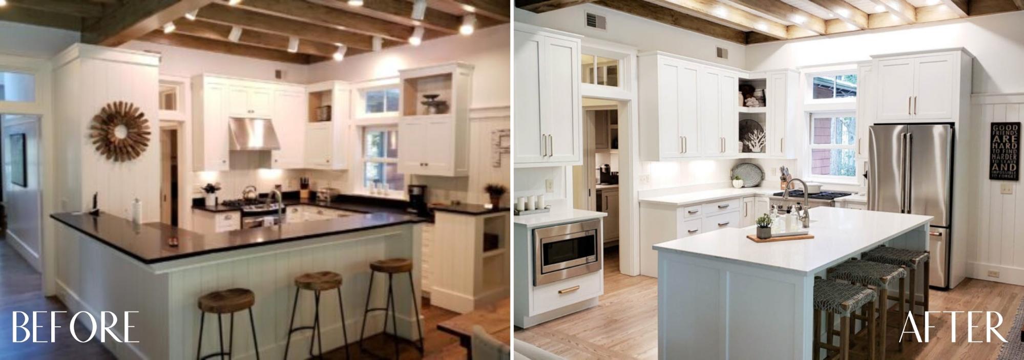
This kitchen remodel is proof that small design decisions can have a major impact! With a tight budget for this investment property, we knew that we would have to analyze the existing features, keep what worked, and be conservative with replacing or remodeling different elements. Luckily, we loved the existing cabinetry, light fixtures, and layout. From there we focused on color. By replacing the backsplash with white subway tile, the space instantly became brighter! To tie in elements from the rest of the home, we painted the kitchen island in a light shade of gray-aqua. We then replaced the turquoise bar stools with more neutral seating selections. The result is an infinitely brighter and more cohesive space!
4. British West Indies
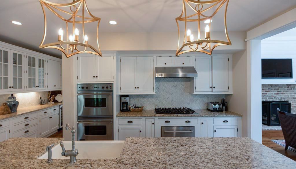
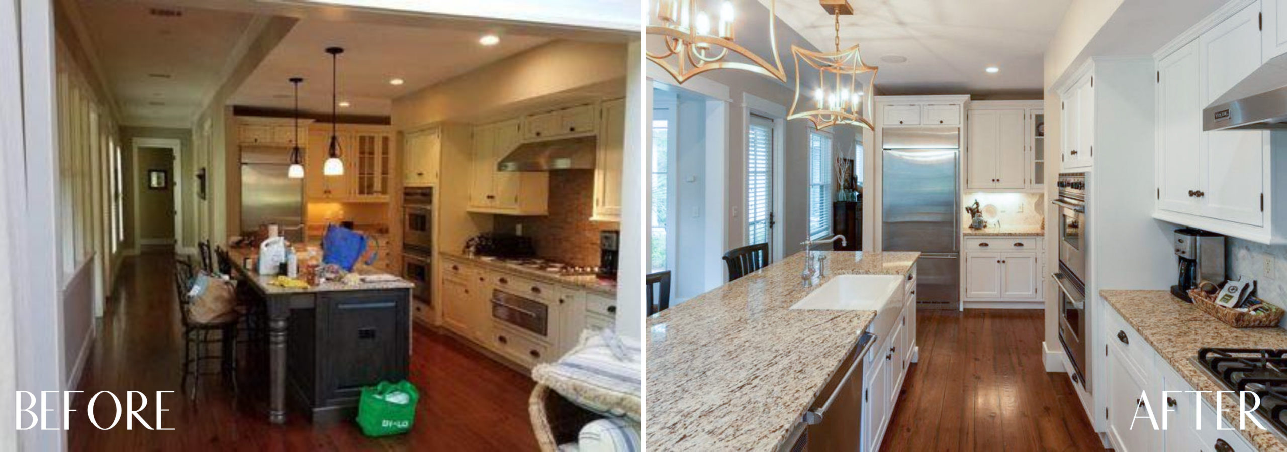
This home was such an unexpected gem! The kitchen before renovation was dark and a bit outdated. By pairing existing elements with intentional changes, we were able to bring out the charm and comfort of the space. We kept the existing cabinets, but opted to paint them in Pure White to match the home’s trim. We also made sure to repaint the kitchen island to match! While an island painted in an accent color works well for other spaces, in this home, the darker island element became lost due to the color of the antique heart pine floors. With a lighter coat of paint on the island, however, we were able to add contrast which brightened the space up significantly. Other key features of this remodel: contemporary gold lighting fixtures, updated tile backsplash, and carefully curated coastal accents.
5. Colorful Modern
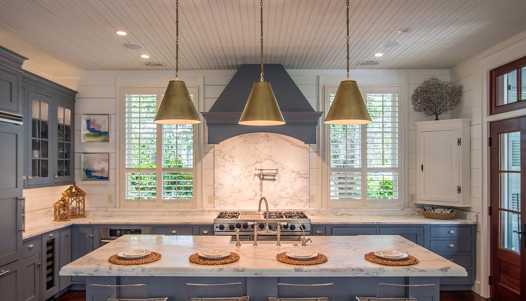
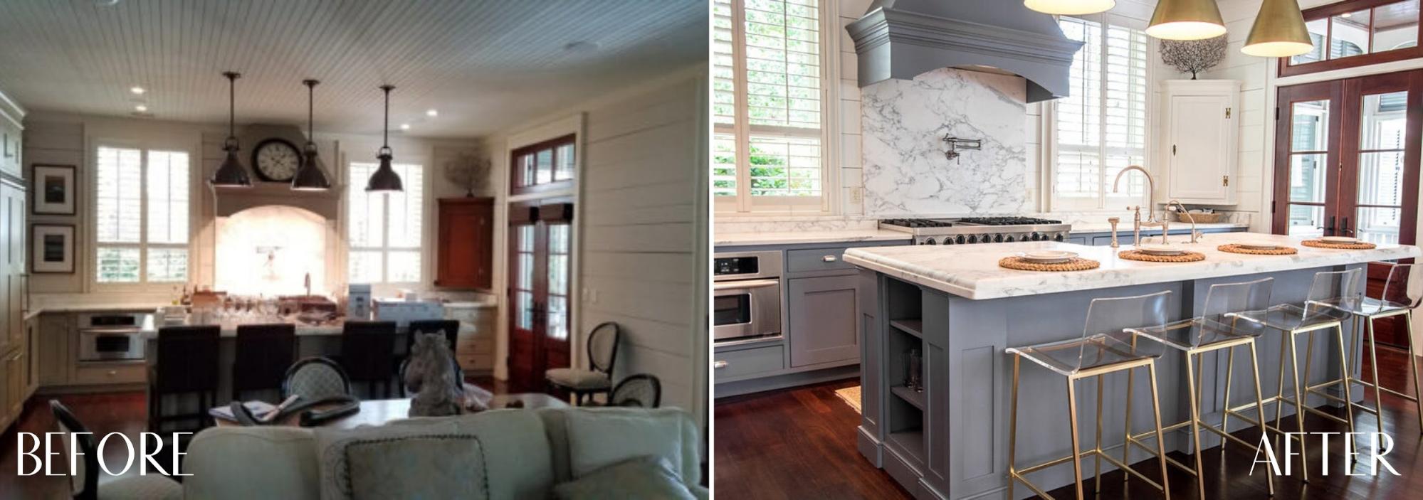
Big and bright were our goals for this gorgeous home, which we transformed from dark, closed off, and outdated into a colorful and modern getaway. Our first task was to paint the entire interior of the home. It’s amazing what a fresh coat of paint can do! Once our fresh canvas was complete, we began bringing color and modern accents into the space. The look of this kitchen was completely transformed with coastal grey-blue cabinetry. We updated the lighting fixtures and swapped out the barstools and voilà—a modern kitchen that remains one of our most popular transformations to date.
6. Nautical Farmhouse
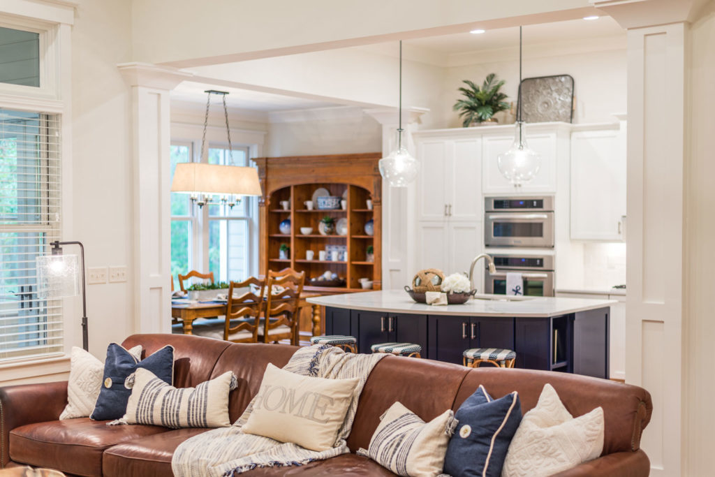
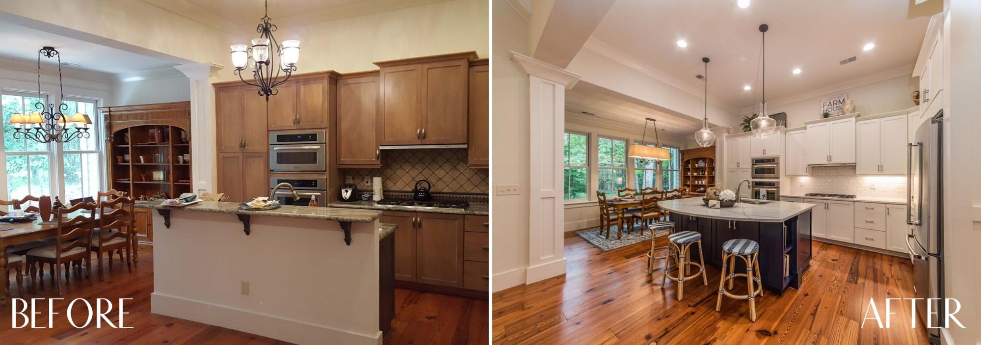
When we see an outdated kitchen, we see an opportunity. Especially if the existing layout is open and inviting, it’s always amazing to see how the right design choices can make a space look brand new. With this kitchen, we started by painting the cabinets in Alabaster by Sherwin Williams. By taking the split-level island and cutting it down to a uniform height, then extending it with a curved bar, the kitchen appears dramatically larger and more open. The new quartz counters added a bit of brightness, contrasted by the island’s coastal navy blue paint. And let’s not overlook the white hand-glazed subway tile backsplash! The results are a fresh, modern kitchen that contributed to this home selling very quickly, and for 20% more than originally planned.
7. Traditional Lowcountry
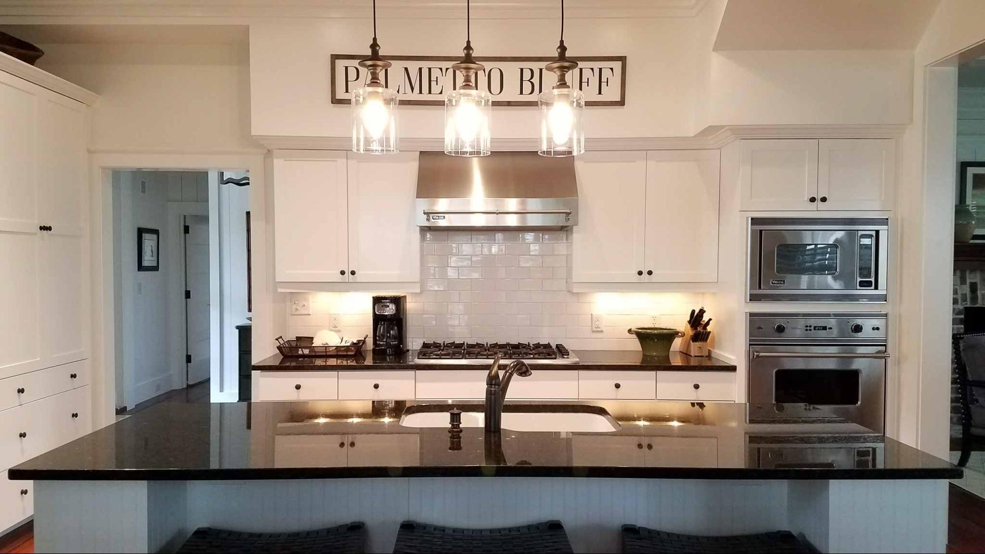
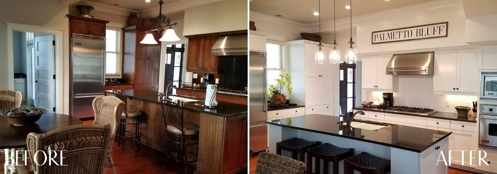
The true test of our kitchen remodeling abilities is when we are under a tight budget and on a time crunch! In this case, we rose to the challenge and even came in under budget! The original kitchen’s dark wood cabinets made the space seem much smaller than it actually was, so we knew our first move would be to give the cabinets and kitchen island a fresh coat of white paint. Another element that made the space significantly brighter was the subway tile—you can’t go wrong with a white backsplash! After replacing the light fixtures and barstools, we added a few Lowcountry decor elements to give this updated traditional home a cozy feel.
Did you feel inspired by these remodels? We’d love to help you make intentional design decisions to update your kitchen or entire home. Send us an email at info@southerngraceinteriors.com—we look forward to chatting with you!